SurveyMonkey
Redesigned SurveyMonkey’s logic builder to simplify complex workflows
My role
Design lead
Team
Myself
Product manager
Content designer
5 engineers
Timeframe
6 months
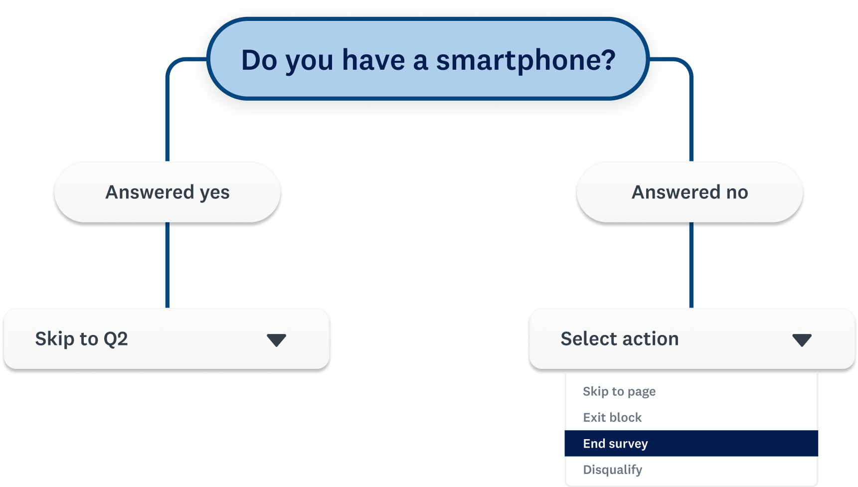
SurveyMonkey users rely on logic to guide respondents through the right questions, but many struggle with how difficult and unintuitive the current experience is.
I led the end-to-end redesign of the logic experience to simplify complex workflows, unify fragmented entry points, and bring consistency across the product. The new design lifted user conversion by 6% in early experiments, and improved logic’s overall usability score by 67% in further user testing.
+67%
Usability improvements, based on user testing
+6%
Experiment conversion improvements, based on the new design
The process
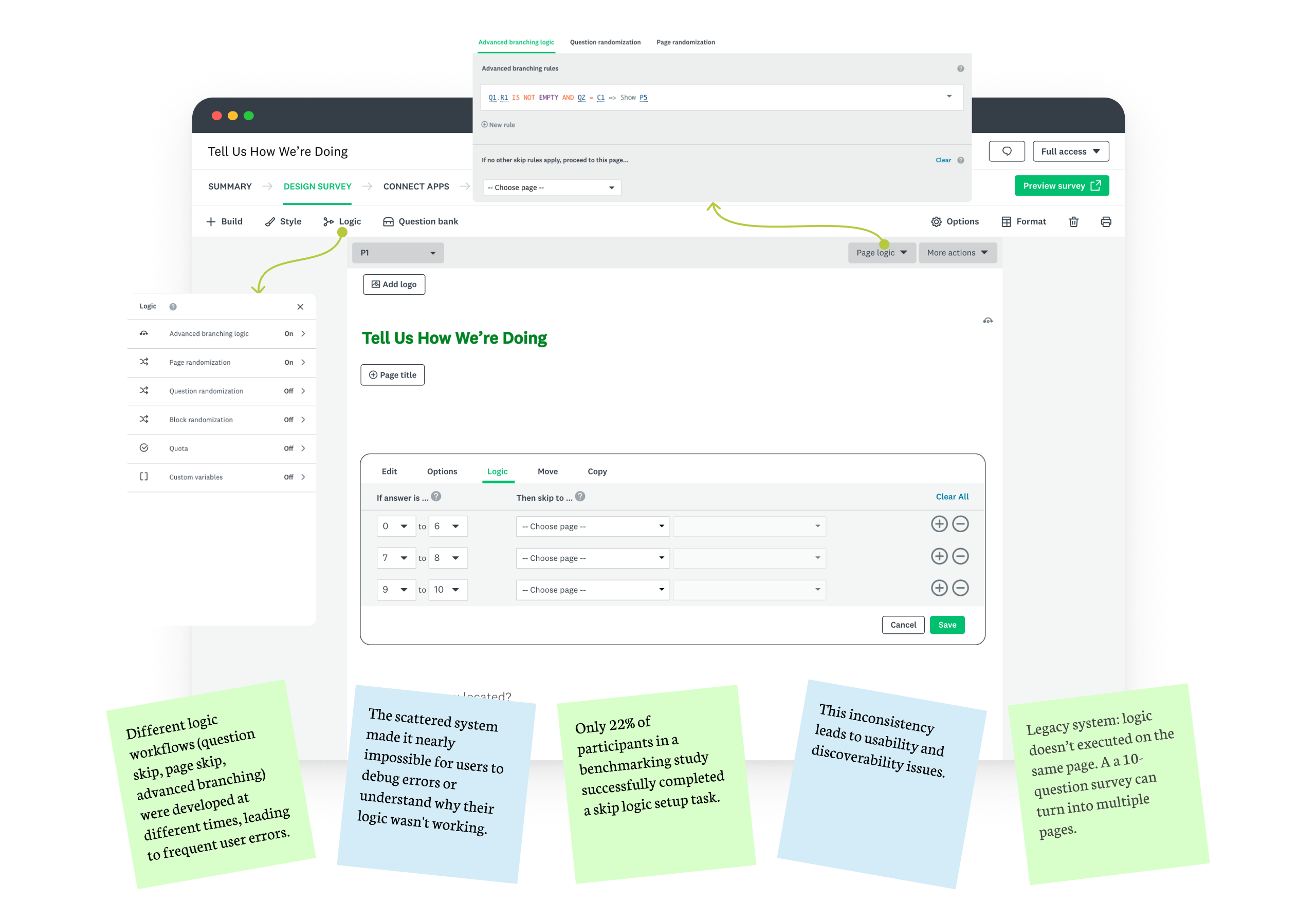
I began by auditing the current workflows and mapping user journeys to identify friction points.
- Users lost context when switching between entry points
- The UI relied heavily on technical syntax rather than natural language
- Limited logic visibility made debugging nearly impossible
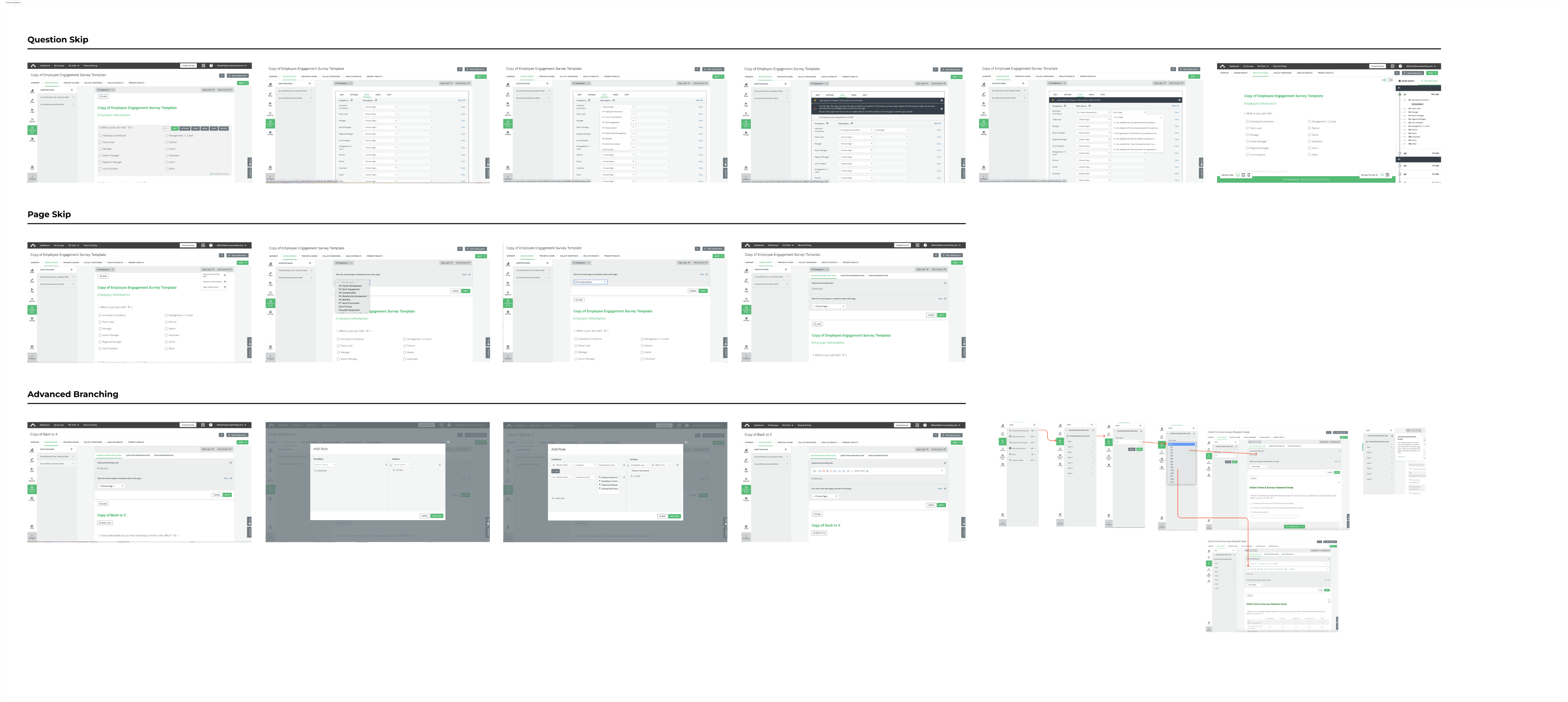
In the explore stage, I primarily focused on two approaches.
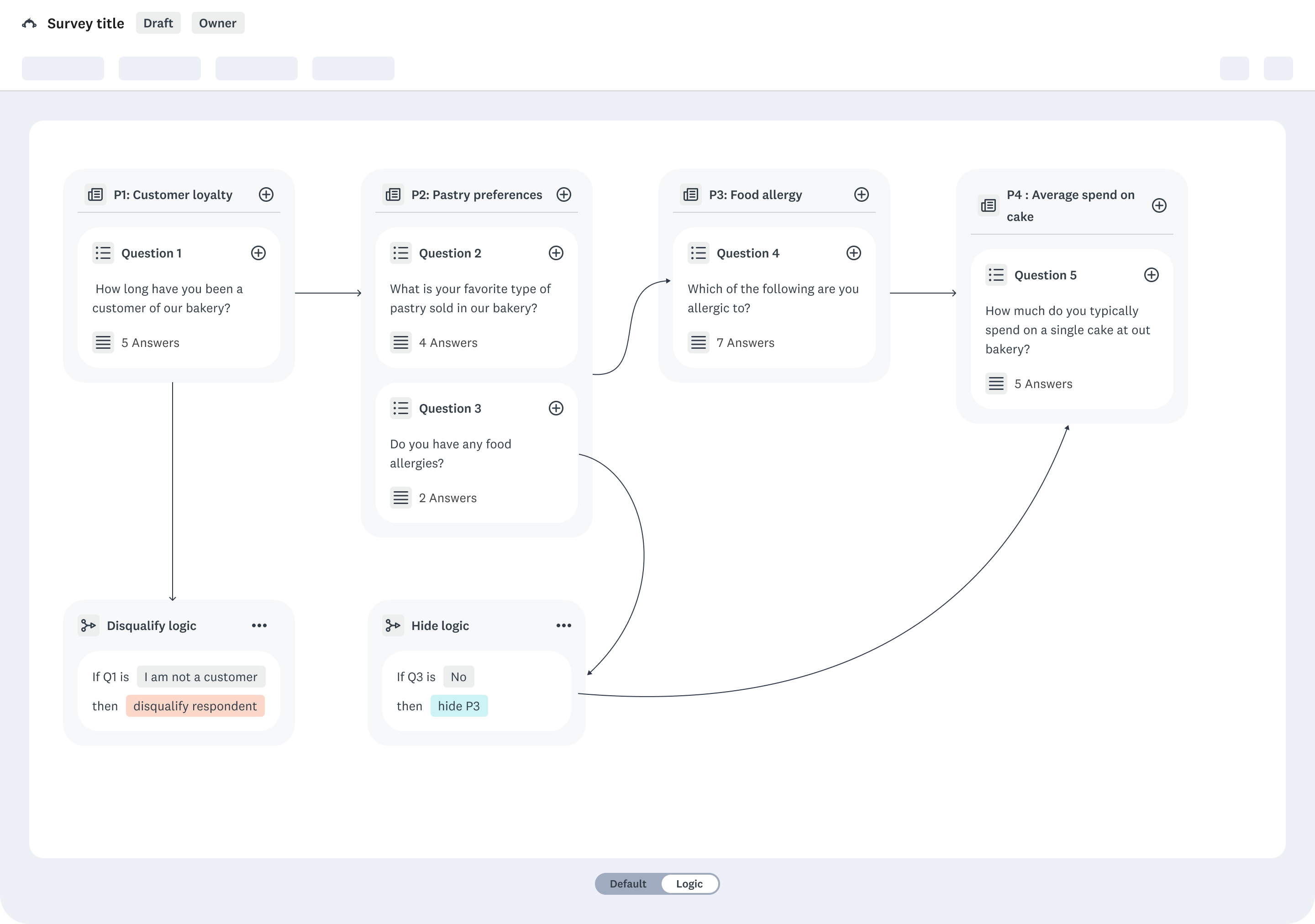
Drag and drop interface
PRO
- Visualize logic in a flow
- Clear visual representation of paths from question A → B → C
CON
- This required a full migration to Next.js — not feasible given our legacy tech stack.
Earlier this year, we circled back to this idea and even vibed coded a prototype using Lovable.
Check it out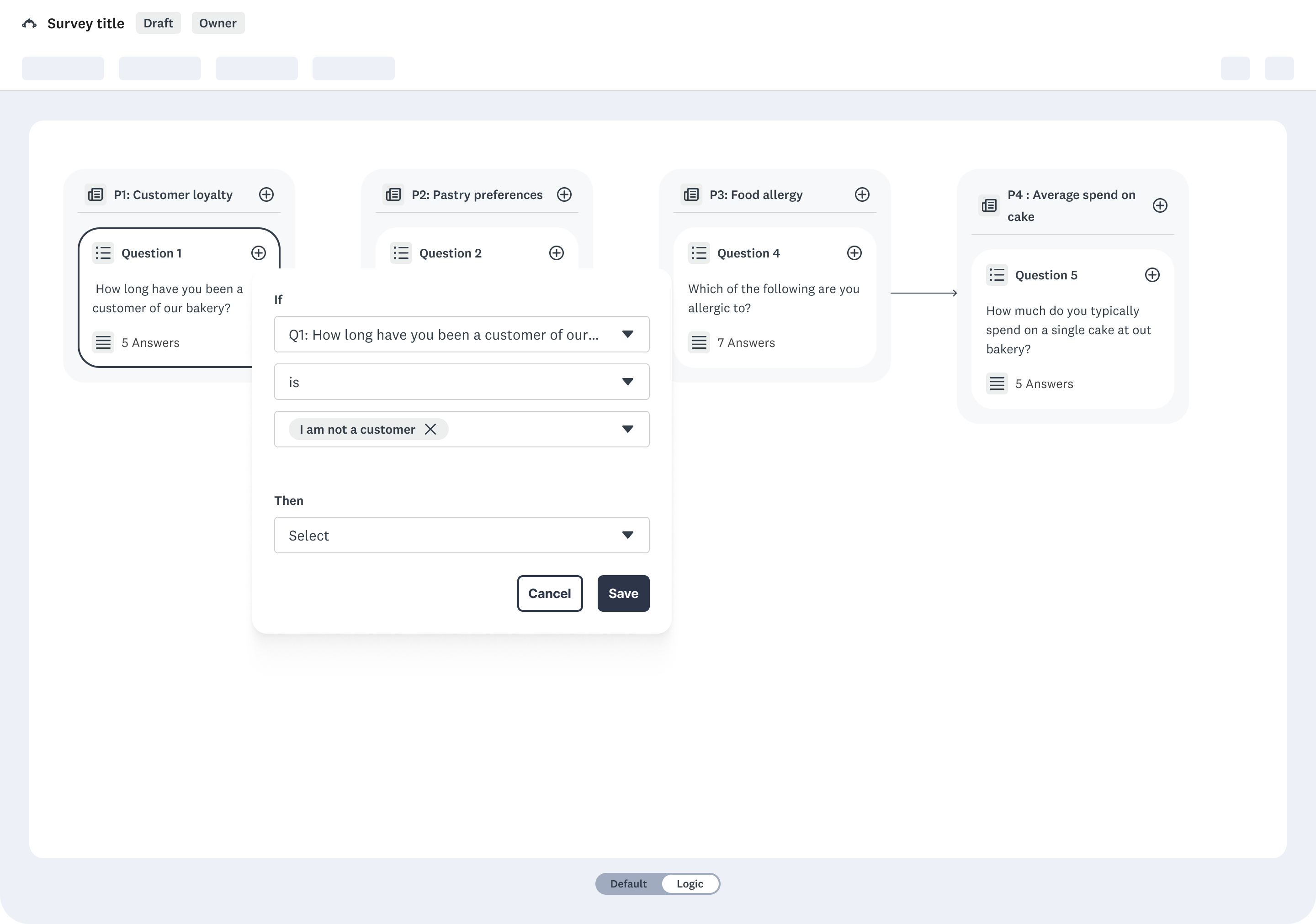
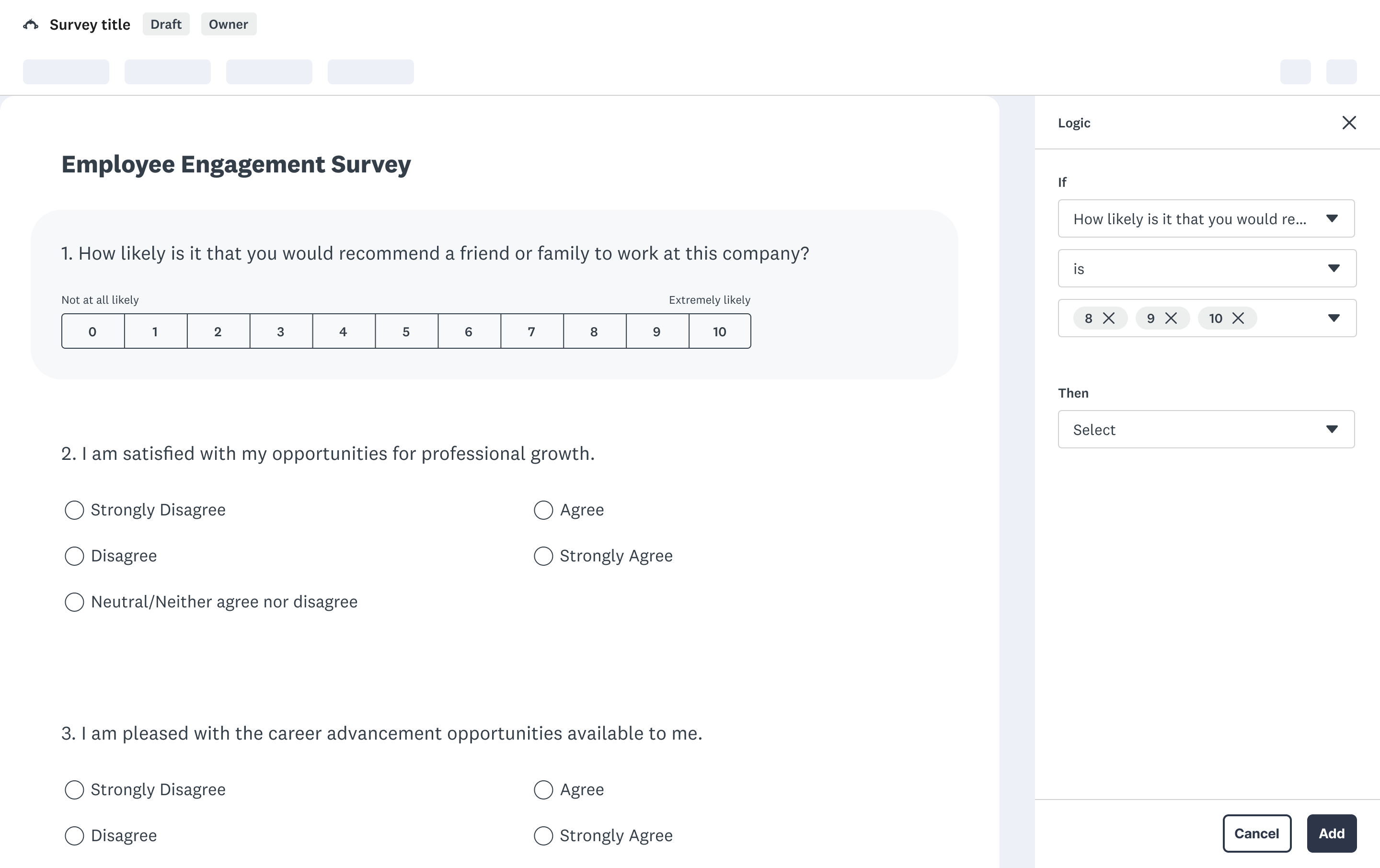
Inline logic editing
PRO
- keeps users in context while building logic
- An inline panel could be built as a React hybrid component, integrated within our existing codebase.
CON
- When working with very complex branching or large surveys, the side panel can feel constrained
Design decisions
We tested both concepts with target users.
- Visual mapping helped users understand simple flows but broke down for complex rule sets.
- Inline editing felt familiar and efficient, especially for power users.
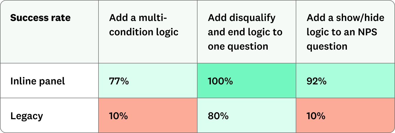
We further tested the inline panel approach against our legacy experience, receiving overwhelming positive results. At the end, we chose the inline panel approach — balancing usability, scalability, and technical reality.
Final direction
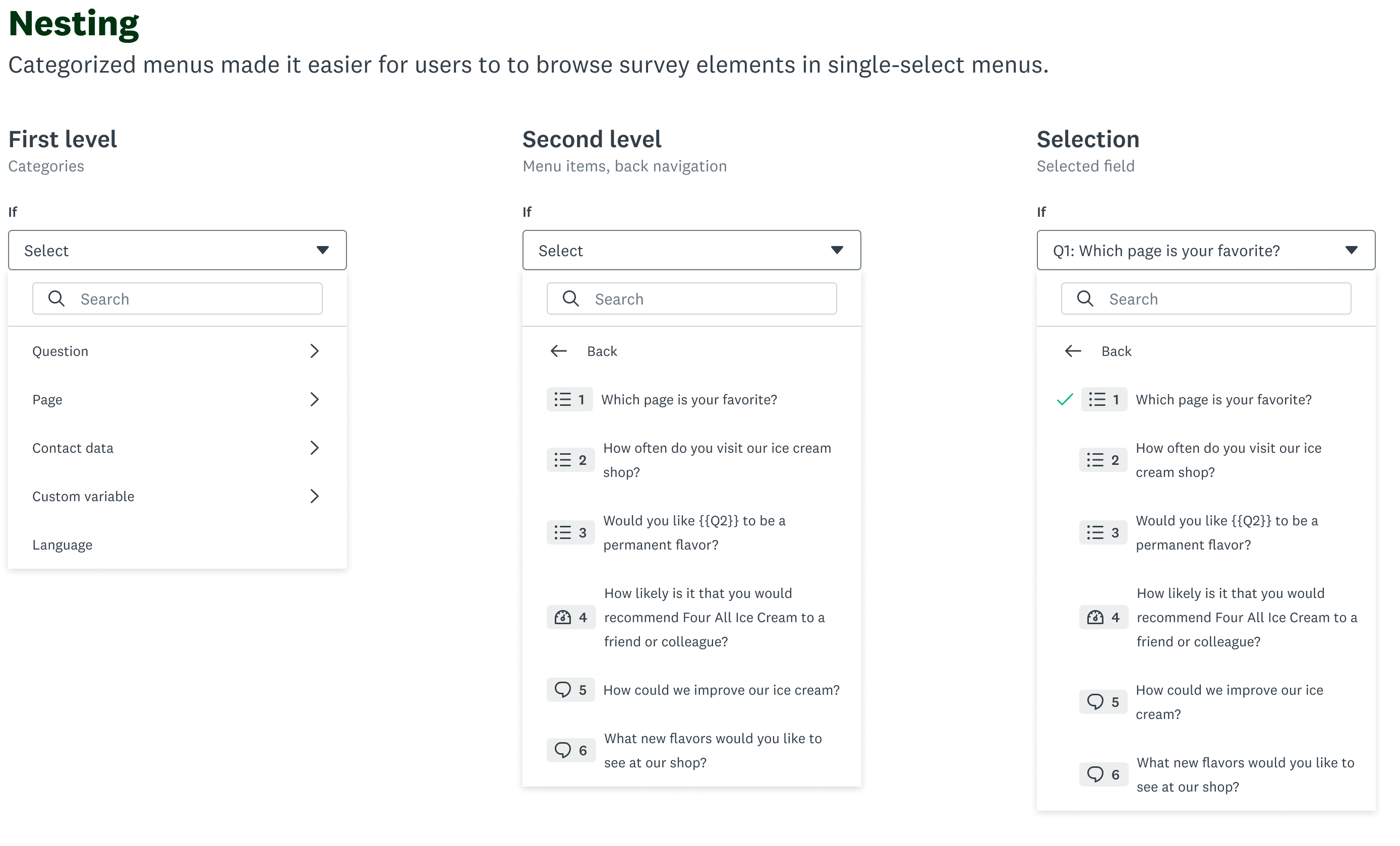
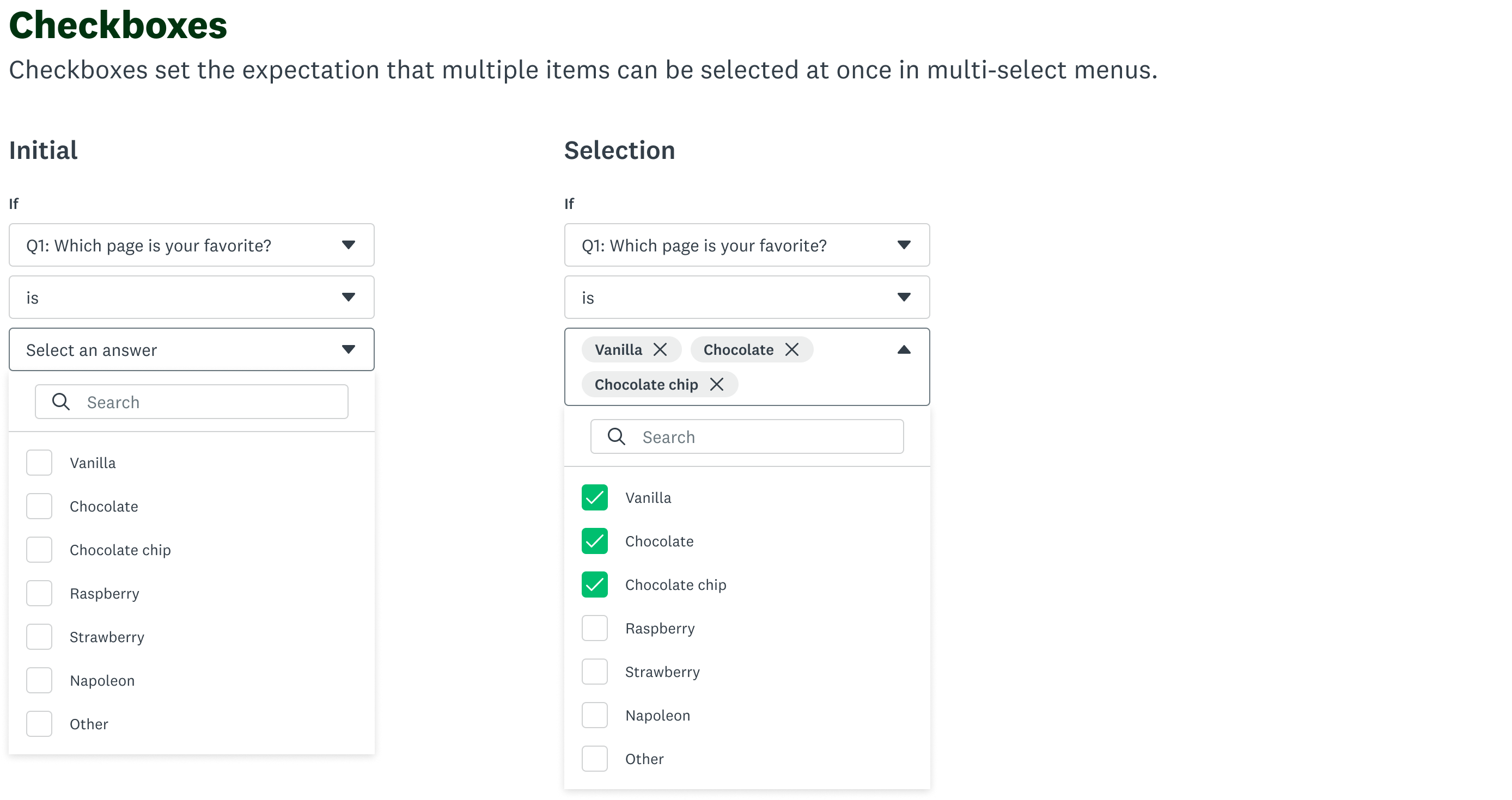
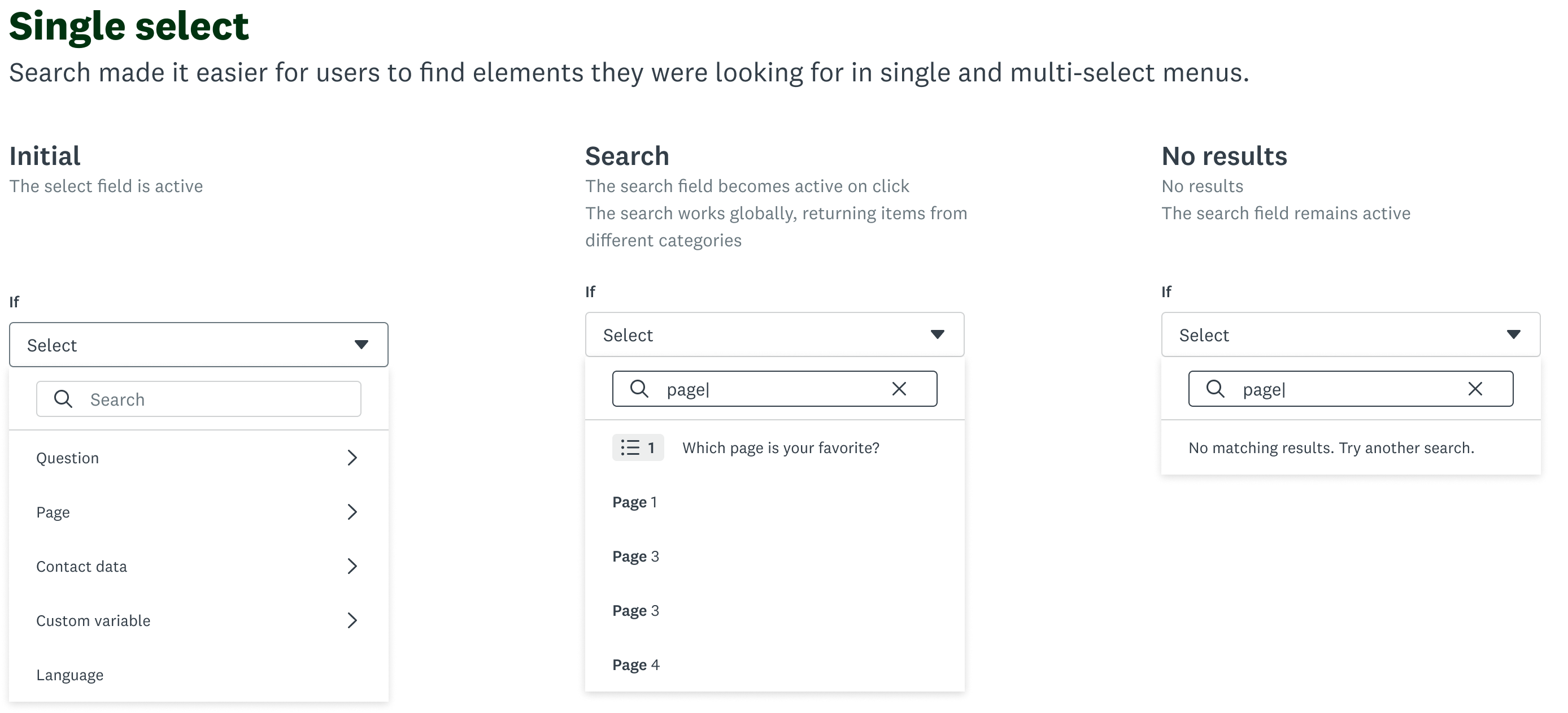
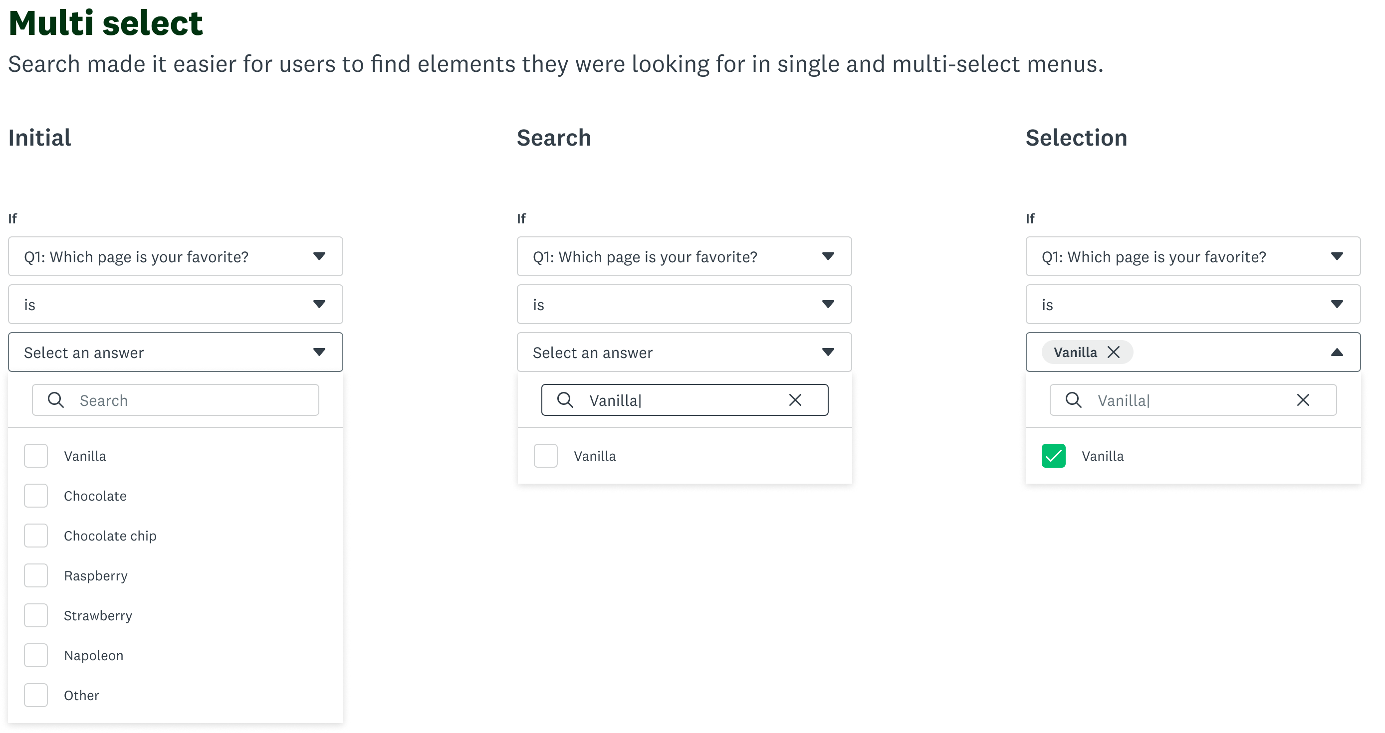
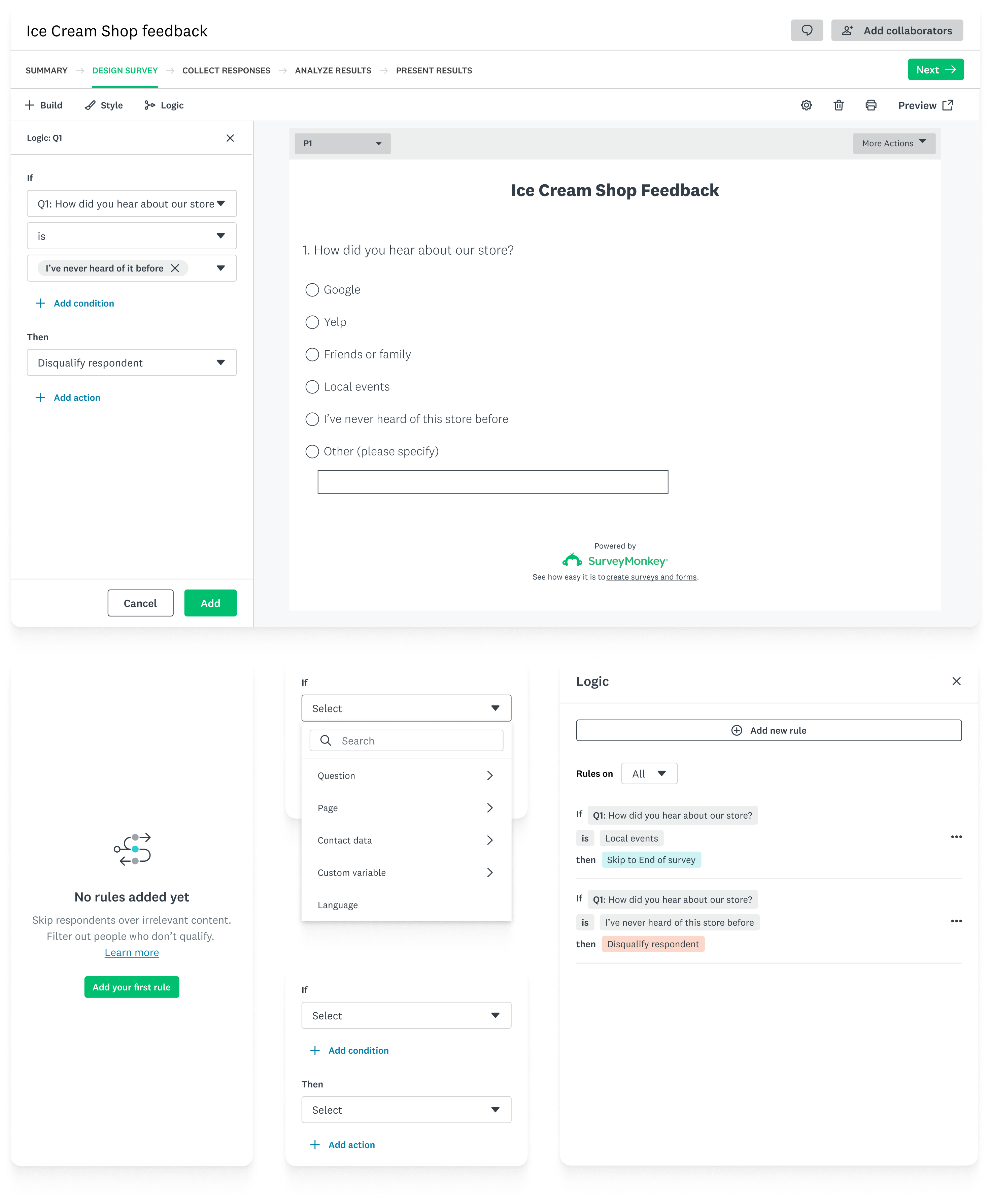
now no matter where users start, they always land in the same logic panel.
This solved the disjointed experience by giving users a single, consistent mental model for how logic works — instead of forcing them to relearn the interface based on entry point.
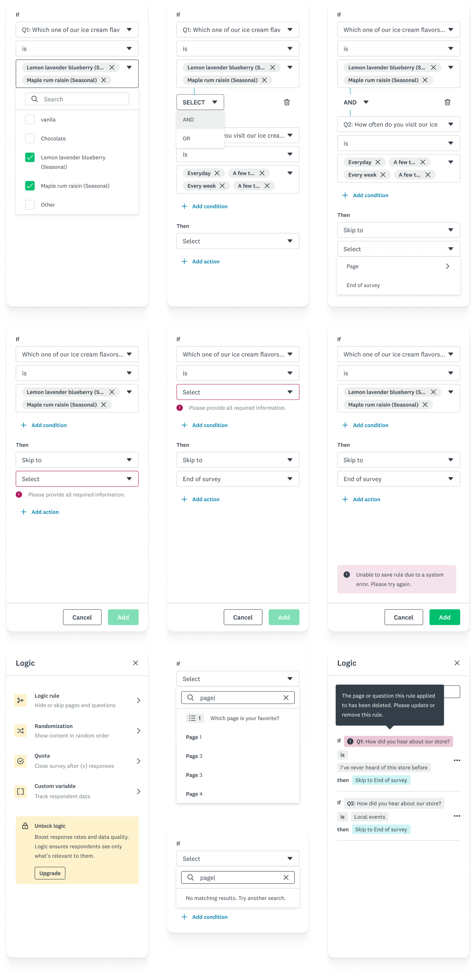
I also pressure-tested edge cases, backward compatibility, and system constraints to make sure the design is not only usable but also realistic to build and scale.
Beyond the project
The creation of the logic building patterns sparked some thoughts with other designers, who began exploring what that could mean elsewhere within SurveyMonkey. I was responsible for sharing the patterns across team, elevating the select component to a design system level, and working with engineers so that it could be consumed across the platform.
“Good design for complex systems is about making complexity feel simple while preserving flexibility.”
Key learnings
Redesigning logic taught me that simplicity isn’t about stripping things away—it’s about creating clarity in complexity. Working through technical constraints pushed me to find elegant solutions that balanced ambition and practicality.
Made with 🤍 in Toronto
© Kira Xie 2025 All Rights Reserved
SurveyMonkey
Redesigned SurveyMonkey’s logic builder to simplify complex workflows
My role
Design lead
Team
Myself
Product manager
Content designer
5 engineers
Timeframe
6 months
SurveyMonkey users rely on logic to guide respondents through the right questions, but many struggle with how difficult and unintuitive the current experience is.
I led the end-to-end redesign of the logic experience to simplify complex workflows, unify fragmented entry points, and bring consistency across the product. The new design lifted user conversion by 6% in early experiments, and improved logic’s overall usability score by 67% in further user testing.
+67%
Usability improvements, based on user testing
+6%
Experiment conversion improvements, based on the new design
The process
I began by auditing the current workflows and mapping user journeys to identify friction points.
- Users lost context when switching between entry points
- The UI relied heavily on technical syntax rather than natural language
- Limited logic visibility made debugging nearly impossible
In the explore stage, I primarily focused on two approaches.
Drag and drop interface
PRO
- Visualize logic in a flow
- Clear visual representation of paths from question A → B → C
CON
- This required a full migration to Next.js — not feasible given our legacy tech stack.
Earlier this year, we circled back to this idea and even vibed coded a prototype using Lovable.
Check it outInline logic editing
PRO
- keeps users in context while building logic
- An inline panel could be built as a React hybrid component, integrated within our existing codebase.
CON
- When working with very complex branching or large surveys, the side panel can feel constrained
Design decisions
We tested both concepts with target users.
- Visual mapping helped users understand simple flows but broke down for complex rule sets.
- Inline editing felt familiar and efficient, especially for power users.
We further tested the inline panel approach against our legacy experience, receiving overwhelming positive results. At the end, we chose the inline panel approach — balancing usability, scalability, and technical reality.
Final direction
now no matter where users start, they always land in the same logic panel.
This solved the disjointed experience by giving users a single, consistent mental model for how logic works — instead of forcing them to relearn the interface based on entry point.
I also pressure-tested edge cases, backward compatibility, and system constraints to make sure the design is not only usable but also realistic to build and scale.
Beyond the project
The creation of the logic building patterns sparked some thoughts with other designers, who began exploring what that could mean elsewhere within SurveyMonkey. I was responsible for sharing the patterns across team, elevating the select component to a design system level, and working with engineers so that it could be consumed across the platform.
“Good design for complex systems is about making complexity feel simple while preserving flexibility.”
Key learnings
Redesigning logic taught me that simplicity isn’t about stripping things away—it’s about creating clarity in complexity. Working through technical constraints pushed me to find elegant solutions that balanced ambition and practicality.
Made with 🤍 in Toronto
© Kira Xie 2025 All Rights Reserved
SurveyMonkey
Redesigned SurveyMonkey’s logic builder to simplify complex workflows
My role
Design lead
Team
Myself
Product manager
Content designer
5 engineers
Timeframe
6 months
SurveyMonkey users rely on logic to guide respondents through the right questions, but many struggle with how difficult and unintuitive the current experience is.
I led the end-to-end redesign of the logic experience to simplify complex workflows, unify fragmented entry points, and bring consistency across the product. The new design lifted user conversion by 6% in early experiments, and improved logic’s overall usability score by 67% in further user testing.
+6%
Experiment conversion improvements, based on the new design
+67%
Usability improvements, based on user testing
The process
I began by auditing the current workflows and mapping user journeys to identify friction points.
- Users lost context when switching between entry points
- The UI relied heavily on technical syntax rather than natural language
- Limited logic visibility made debugging nearly impossible
In the explore stage, I primarily focused on two approaches.
Drag and drop interface
PRO
- Visualize logic in a flow
- Clear visual representation of paths from question A → B → C
CON
- This required a full migration to Next.js — not feasible given our legacy tech stack.
Earlier this year, we circled back to this idea and even vibed coded a prototype using Lovable.
Check it outInline logic editing
PRO
- keeps users in context while building logic
- An inline panel could be built as a React hybrid component, integrated within our existing codebase.
CON
- When working with very complex branching or large surveys, the side panel can feel constrained
Design decisions
We tested both concepts with target users.
- Visual mapping helped users understand simple flows but broke down for complex rule sets.
- Inline editing felt familiar and efficient, especially for power users.
We further tested the inline panel approach against our legacy experience, receiving overwhelming positive results. At the end, we chose the inline panel approach — balancing usability, scalability, and technical reality.
Final direction
now no matter where users start, they always land in the same logic panel.
This solved the disjointed experience by giving users a single, consistent mental model for how logic works — instead of forcing them to relearn the interface based on entry point.
I also pressure-tested edge cases, backward compatibility, and system constraints to make sure the design is not only usable but also realistic to build and scale.
Beyond the project
The creation of the logic building patterns sparked some thoughts with other designers, who began exploring what that could mean elsewhere within SurveyMonkey. I was responsible for sharing the patterns across team, elevating the select component to a design system level, and working with engineers so that it could be consumed across the platform.
“Good design for complex systems is about making complexity feel simple while preserving flexibility.”
Key learnings
Redesigning logic taught me that simplicity isn’t about stripping things away—it’s about creating clarity in complexity. Working through technical constraints pushed me to find elegant solutions that balanced ambition and practicality.
Made with 🤍 in Toronto
© Kira Xie 2025 All Rights Reserved