My Role: UX Designer & User Researcher
- Conducted 13 in-depth interviews to identity members’ needs with the organization’s digital platform
- Did the UX Design including creating key user flows, sitemap, and wireframes.
- Created the mid-and high fidelity prototypes to show the full product experience to show the client and validate design ideas.
Duration
Apr - Jul 2021 (4 months)
Client
California Film Institute
Team
Myself, with guidance from the Director of Marketing and Audience Engagement at the California Film Institute
Project Overview 📋
What is CAFILM?
The California Film Institute (CAFILM) is a non-profit organization dedicated to celebrating and promoting film art and education through a series of annual programs, including the internationally acclaimed Mill Valley Film Festival, the documentary film festival DocLands; CFI Education, as well as a rich program of classes and hands-on workshops.
Project Challenge 🤯
The organization has done an amazing job bringing its film festivals, in-theater movie selections, and education programs online by introducing their digital platform CAFILM since Covid-19 first hit in March 2020. However, since the contents on CAFILM are scattered in different places and categories, the new audience of CAFILM had a difficult time understanding what they can do with the new digital platform CAFILM, according to the marketing department of California Film Institute.
Project Objectives 🎯
I worked with the Director of Marketing and Audience Engagement at California Film Institute, Daniel Diaz, through Catchfire from March to July 2021 to conduct UX research on its digital platform and redesign its current website with a modern and user-friendly look and feel.
The main objectives of this project were to
Understand why people find it hard to understand what they can do with the new digital platform and,
how we might make it easy for people to understand what they can do with CAFILM and improve their watching Experience on CAFILM
Develop or extend coherent branding that aligns with CAFILM’s current and potential clientele and customer experience.
Business Opportunities 📊
This project would help the organization better understand how to align its digital presence with its new audience strategy and digital objectives.
Final Deliverables 💼
In 4 months,
I finalized the UX research report deck,
developed mid- and high-fidelity prototypes for user testing to validate design ideas,
worked with the in-house web designer to create design specifications,
developed coherent branding for the website, including style tile, responsive UIs, and UI Kit.
Understand the Problem Space 💡
Website Analysis
To explore the problem space, I conducted an analysis of the current experience to highlight underlying pain points.
Donation Call-To-Action
The highlighted CTA doesn’t do a good job at explaining what the organization does and why people should make a donation.
Grid View
The website uses a grid view to showcase the organization’s different programs. However, the images alone do not tell new visitors to the site much about what each program is about.
The Movie Theater
Currently, it’s hard to know that the banner would lead users to the movie theater page where they can purchase movie tickets
Top Header
Currently, CAFILM only uses a text-only header to invite users to its main movie page. The design is off-brand to CAFILM’s visual identity as an art and film organization.
Movie Schedule
Currently, the movie schedule is split into a 4-column layout. However, this design is not accessible.
Movie List
The current movie list doesn’t give users the option to choose between in-theater only or home streaming movies.
Confusing member v.s. public sign-in
Currently, members need to sign in with their member ID to enjoy all the member benefits. However, members can easily forget their member ID if they never save it to their browser. They can also mistakenly use the public sign-in link via the first box and purchase a movie ticket with the regular price
No guest checkout
Non-members have to create an account in order to purchase movie tickets from CAFILM.
Understand the Competitions 🎬
Competitive Analysis
I then analyzed the market landscape by looking into prominent film and art organizations across the globe and major competitions of CAFILM on the West Coast.
Lincoln Film Center
Value Proposition
Lincoln Film Center is an established movie venue located in Lincoln Center NYC. Its digital platform mainly serves people who are looking into indie films and movies and supports the Lincoln Center film society.
Pro:
Information architecture
Clean Movie Schedule
Regular original contents
Cons:
Virtual Cinema can only be accessed through secondary menu
Sundance Institute
Screenshot of sundance.org
Value Proposition
Sundance Institute is an established non-profit organization that runs the annual Sundance Film Festival. It offers various programs for filmmakers and the public.
Pro:
Reputation and on-brand online presence
Strong CTA to the Sundance Film Festival
Regular original contents
Cons:
Hard to find events and workshops that are open to public
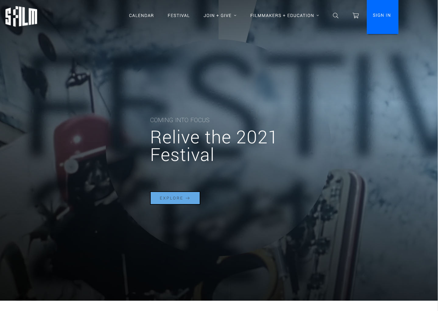
SFFILM
Screenshot of sffilm.org
Value Proposition
SFFILM is a recognized film organization that runs San Francisco International Film Festival. It has an established and simple-to-use digital platform that promotes its film festival, membership, filmmaking, and education programs.
Pro:
Reputation and on-brand online presence
Strong CTA to the Sundance Film Festival
Regular original contents
Cons:
No guest checkout available
Empathize with the Users 👥
User Interviews
To better understand the users of CAFILM, the Director of Marketing and Audience Engagement, Daniel Diaz and I recruited 13 participants from 3 different cohorts. Each interview took about half an hour followed by structured usability testing, where each participant was asked to perform a few tasks with the site.
Demographic
7 females, 6 males; between the age of 23 to 74; Currently resided in the San Francisco Bay Area; Have an interest in movies or programs that CAFILM supports
Goals
to better understand the CAFILM’s target audience’s goals and needs of the existing digital platform.
Outcome
From these interviews, I discovered major areas that this redesign project could focus on and how to improve the users’ watching experience on CAFILM in the future
Interview Insights
Landing page experience
Currently, It is hard for cohorts 2 and 3 (nonmembers) to understand what the organization does based on the landing page due to its lack of information.
PARTICIPANT 12
“I think the site assumed that people already know everything about the organization. I want a bit more clarity of what the organization does”
Ticket Checkout experience
Nonmembers (cohorts 2 and 3) were unable to check out their movie tickets online without an account. A guest checkout feature is desired.
PARTICIPANT 3
“Putting in my information could waste me a lot of time because it was a long form. Guest checkout would be a lot better because I am not a member.”
Watching experience
Currently, it’s difficult for everyone to differentiate the difference between in-theater only and home streaming movies online. Many assumed all movies are in-theater only given the theater’s recent reopening.
PARTICIPANT 4
“Some movies have indications that they are available in theaters and some are available for both. But some movies, like the one we just chose didn’t indicate it could be streaming at home unless we go on to the checkout page.”
Bad user experience for senior members
Senior members felt that the ticket check-out process was hard to get by. Some senior members failed to redeem their benefits online (unlimited access to movie tickets) due to the poor ticket checkout experience.
PARTICIPANT 14
“(As a donor) When I can’t figure out the get ticket process for streaming in particular, I would just buy the ticket (despite my donor benefits give me unlimited access to movie tickets).”
Problem Identification 💡
Problem Identification and Prioritization
I identified the different problems through the synthesis of my interview notes. Then I narrowed down the broader themes into HWM statements and plotted them on a quadrant based on their values and complexity.
Due to my time and the organization’s time and resource constraints, we decided to focus on two HMW statements until the organization has more resources to consider the rest:
How might we make it easy for people to understand what they can do with CAFILM?
How might we make it easy for people to check out movies online?
Design Goals 🎯
Watching Experience
Enable users to choose between in-theater and home streaming movies easily
Include more information about the films, such as movie trailers, and premises.
Landing page
Include explanations on what the organization does
Include what members and the public can do with the organization
Design Exploration 🎨
Landing Page
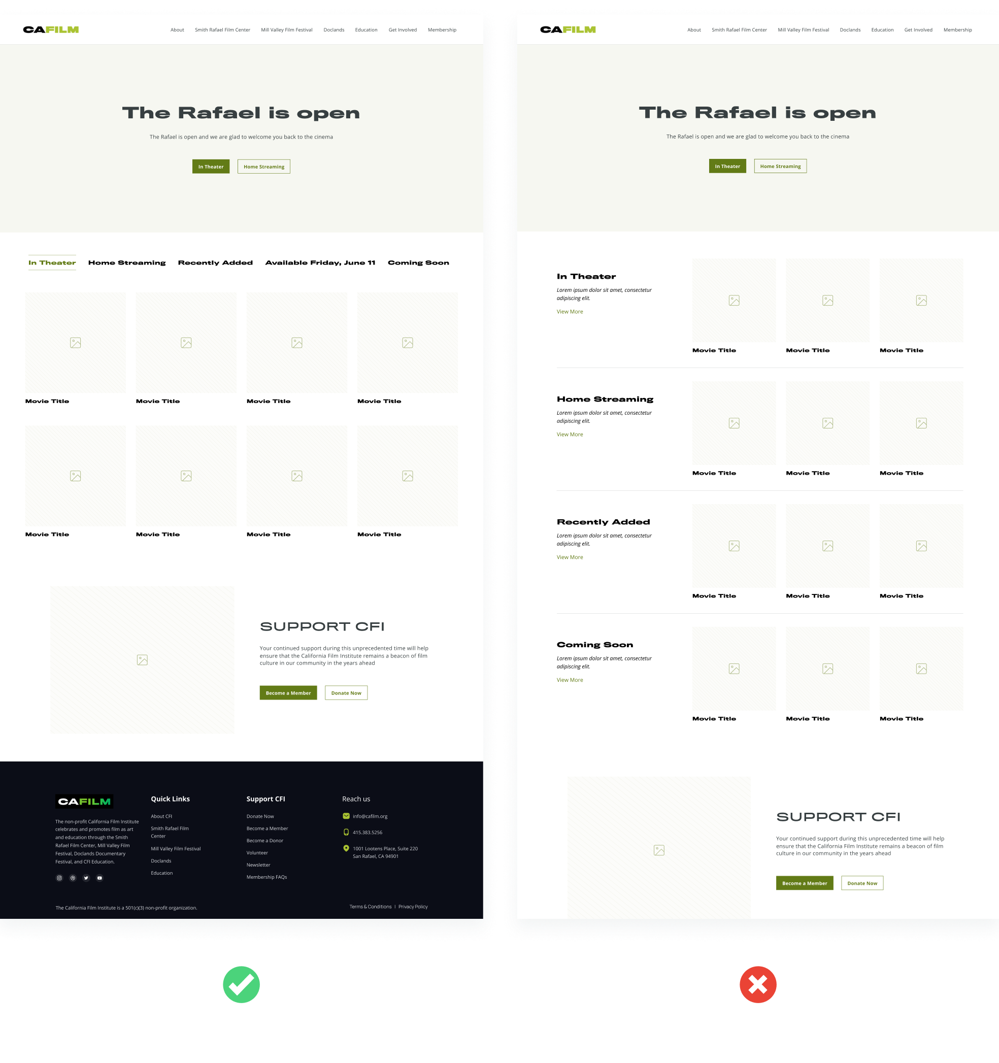
Based on the information I gathered from research, I proposed two design options for the landing page. I showed the design to the executives at CAFILM and got the second design approved.
Design features:
The tagline of the organization stands out in the new design
Explanations on what the organization does and what each program it offers (such as DOCLANDS, MVFF, and CFI Education) stand for
Reasons that got the second design approved
An emphasis on Membership and how to support FILM, which aligns with the organization’s new audience strategy and digital objective
The movie landing page
Similar to redesigning the landing page, I presented two designs to the executives at the organization. Both designs enable users to quickly choose between in-theater or at-home streaming movies. The first design required less technical effort than the second one. The executive couldn’t decide which one to go with so we decided to conduct an A/B test on both designs.
A/B testing
The result suggested that both site designs perform relatively similar to each other. Based on the result, we decided to move forward with the first design.

Final Design 🖌
Landing Page

Final Design 🖌
Movie Page

Other deliverables 💿
Visual Identity
I further developed the visual style of CAFILM by building on the existing visual identity of CAFILM and adding reusable UI elements.
Site Map 🧭
Reflection📝
Next step
Work with the in-house web designer to implement the new landing page and movie page designs to the current site
For future improvement, I would love to do usability testing within the member network in a long term and involve more senior members to uncover the issues they have with the site. Since many members of CAFILM are senior citizens, it is necessary to prioritize their user experience for the next iteration.
What I learned
expanded my knowledge of UX research skills through the facilitation of user interviews and usability testing sessions.
Improved my cross-functional communication skills by working with the client’s team and leading design critique sessions to receive feedback and take technical limitations into consideration.
furthered my skills in design storytelling by taking ownership of the design process and presenting my design and research findings to the client.
Challenges I ran into
The ticketing experience of the website runs on a different platform, “Agile Ticketing”, which makes it hard to tailor a solution to address issues around the ticketing experience without heavy engineering efforts. Therefore, the client and I decided not to focus on improving the ticketing experience of the website.
Although this redesign will not focus on the information architecture of the site, the interview data suggested that the multiple domains that CAFILM owns confused the users. A more practical practice is to stay on one central domain and have a sub-domain for each page. This is a conversation that has to be made before thinking about redesigning the site’s navigation structure in the future.


