Outschool 2022
Notifications
In Q1 2022, I designed Outschool’s first in-app notifications that would help us increase learner retention on the platform. Currently, notification has been released to all learners.
Project Summary
We wanted to build in-app notifications for learners. Based on research, we learned that learners want to stay updated on Outschool activities such as classroom posts, group posts and teacher messages.
I was the main designer leading this project in Q1 2022, from ideating early concepts to running usability testing, presenting design regularly to leadership, and delivering end-to-end assets for production. I worked with multiple stakeholders that included 1 product manager, 1 UX researcher, 1 UX writer and 3 engineers.
The Problem
Currently, emails are the only way they can get notified. However, only 3% of learners on Outschool have emails associated with their accounts. If we keep using emails to notify learners, 97% of them will miss out on important updates.
Business Goals
From a business perspective, we wanted to increase learner retention on the platform by allowing learners to re-engage with our platform. To measure the success of this project, we will look at:
Engagement: 60% of learners with a notification have engaged with a notification on a weekly basis
Retention: 80% [previously 70%] Week-1 retention
Final Solution
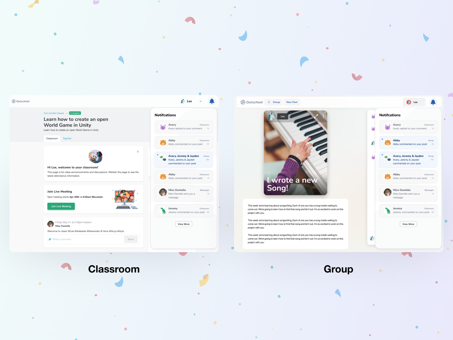
If Outschool wants to be a learner-led product, we should notify learners where they spend most of their time. As 90% of the learners attending classes on Outschool visit learner spaces, we built notifications in-app on learner space to help learners stay in the loop on their Outschool activities in groups, classes, and messages.
Help learners discover the feature
Through research done after we ideated the early concept, we learn that our learners (mostly between the age of 8 - 12) may be new to notifications and/or used to ignoring them. When learners come back to their space, we wanted to help them discover this new feature by using an in-product banner.
Promote simple design
In the early design explorations, we explored designs that called out @mention and different categories (class, group and message). However, through usability testing, we learned that it wasn’t easy for learners to notice complicated UI components like tabs and filters. In the final design, we kept the IA simple by taking out the top tab and putting the time stamps inside individual notification cards.
Access anywhere
We know that we want to help learners discover their notifications easily. In the final production, learners are able to see notifications in one central location, regardless of where they are in the learner space.
Result
Notifications were launched on April 4, 2022. Since its launch, we’ve seen
80% [Goal was 60%] of learners with a notification have engaged
88% [Goal was 80%] Week-1 learner retention rate
To learn more about this project, please contact me for a personal chat.


